VolShop Mobile App
Context
My journey into UX design started with my first course at the University of Tennessee. I took an online class where I collaborated with students who were passionate about user-centered design in the Information Sciences Club.
In this course, I delved into user research and design. The project was part of UTK's INSC 311, which emphasized User-Centered Design, involving user research, gathering requirements, and creating user-friendly products.
Our project aimed to improve an existing application or create a new user-centered interface. We researched, designed a prototype, evaluated it, and presented our findings to our peers.
Timeline: Feb 2022 - May 2022
Team: Rami Anguiano, Andrew Owens, Jason Sims, Everette Pettigrew
PROJECT OVERVIEW
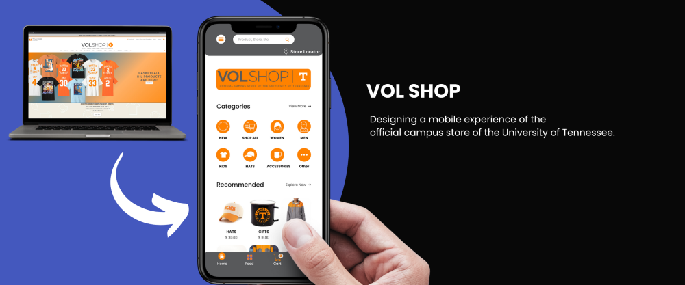
As mobile usuage is on the rise, my team and I wanted to create a mobile version of the University of Tennessee's Store "Vol Shop"
Product Concept Statement: VolShop App
As of right now there are no mobile applications in the market that serves a platform for anybody wanting to buy University of Tennessee at Knoxville gear. We are proposing a mobile application which would make it easy for anyone wanting to purchase UTK gear to promote Vol pride for faculty, alumni, students, and fans. Being able to buy gear/clothes off the app makes it easier to buy when not near a computer or pulling up the website on a mobile app.
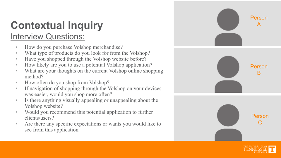
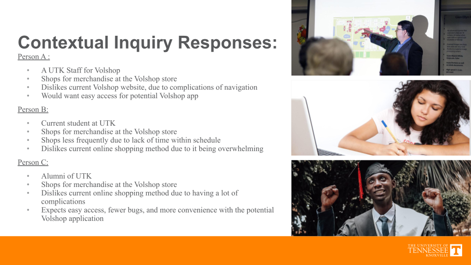
RESEARCH
Interviews were conducted on a variety of possible users such as UTK students, UTK Staff, and general Vol fans.
Analysis
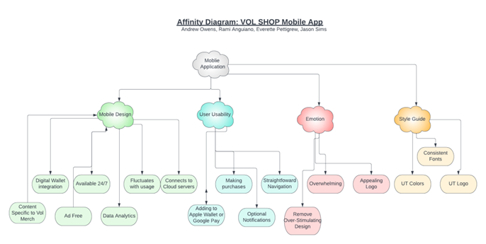
Requirement #1: Usability
Summary of need: The control panel needs to be simplest, sleek, and consistent. This should be
minimalistic to reduce confusion.
Detail of need: The overall design needs to be straightforward in the display of VOL products.
This way the user can easily find products they may want.
Having clearly labeled
navigational tools allow for a less painless experience for the user base.
Rationale: Users need to be able to learn the system quickly and intuitively. Users should be
able to return to the app and recall the knowledge that is in their heads.
Note: The user group will be students, faculty, and general VOL fans so the design needs to be
direct for general understanding and accessibility.
User Requirement #2: Security
Summary of need: Register feature track orders and payment information
Detail of need: The design that will be implemented into the application’s interface will have a
panel where users can access their account which will hold users’ order history, process of
their current order,
and payment methods- users can update their payment method.
Rationale: Information needed for users to input payment details for future orders and
information users can seek of the process of their order.
Data integrity will be in place to
make sure personal credit card information is secured and never given out to unauthorized,
third-party organizations.
Note: Integrity is a built in standard when it comes to PCI usage.
User Requirement #3:- UTK branding likability
Summary of need: Style Guide with utk colors logos and smokey
Detail of need: UTK brand guidelines are established to unify and communicate with the community.
Keeping the visual identity of revolving around utk brand guidelines preserves and communicates the
university personality and reputation.
Rationale: Keeping up with the standard of utk brand guidelines will aid in the strategic vision
which aids in user familiarity.
Developing a sense of pride, meaningfulness, visionary
optimism.
Note: The need to follow brand guidelines is a necessary legal requirement
Design and Conclusions
- The application design aims to fufill a simple sleek design that is easily recognizable from other UTK mobile applications.
- The function of the front page when you click on the app is to sign in as a returning customer or student. But also have the option to create an account if the user doesn’t have a UTK account.
- Once in the app, the front page will have the different categories so that the user can get to what they are looking for very easily. Along with this, a tab at the top right which pulls up many different options for the user to change personal information or change preferences.
- Having a feed, that is on the bottom, allows users to look at either the most recent things that are for sale or promotions made by the VolShop. The second picture is of the cart tap. This allows the user to see what they have in their cart but also a save for later option that allows them to save items they like but might not want to buy just yet.
- The application on the mobile is deceiving, with a simple sleek design that is easily recognizable from other UTK mobile applications.
We limited our hex codes, fonts, fontsize, and syntax to UTK Branding Guidlines. We also wanted to make an option for dark and light mode for better accessibilility.
PRESENTATION
Project Takeaways
The top takeaways for me personally was A LOT. This was my first UX project ever, and on reflection there are many things for me to improve. Here are the main things I learned